Mobile app or mobile web? Progressive web apps take the strong points of both to create a unique user experience. A number of world known companies have already launched progressive web apps and here is what they got.
In short, you can consider Progressive Web Apps (PWAs) a website built using web technologies which interacts with a user as an application. Developments in browser technologies, cache and Push-interfaces allow us to install PWAs on home screens directly from the browser, receive push notifications and even work offline.
If you want to find out what a PWA is and why it is such a buzz topic today, you can check our in-depth article about it.
Some leading-edge companies are already reaping the benefits of PWAs. We invite you to take a closer look at best progressive web apps examples from 6 different industries and learn from their success stories!
Lancome
Industry: E-commerce
Monthly traffic – 74.3K
Visit: lancome-usa.com
The French perfumes and cosmetics house is a part of the L’Oreal luxury product distribution. The company has launched its progressive web app aimed to deliver an app-like experience on the mobile web to its large target audience.
The Challenge: Growing Mobile Traffic with Low Conversion Rate
In spite of the fact that visitor traffic on mobile devices was continually growing, the conversation rates were far from those from a desktop – only 15%. It became a wake-up call showing the mobile website caused significant difficulties for users when they tried to purchase. Additionally, the overall performance was too slow.
The Solution: Progressive Improvement of Mobile Web
In order to improve mobile conversions and the overall shopping experience, Lancôme decided to rebuild the mobile web into a PWA. Initially, the company considered building an e-commerce mobile app. However, this would’ve only provided value for regular customers. Others had no need to download the app as they only shopped once in a while.
The Results: Mobile Revenue Increased up to 36%
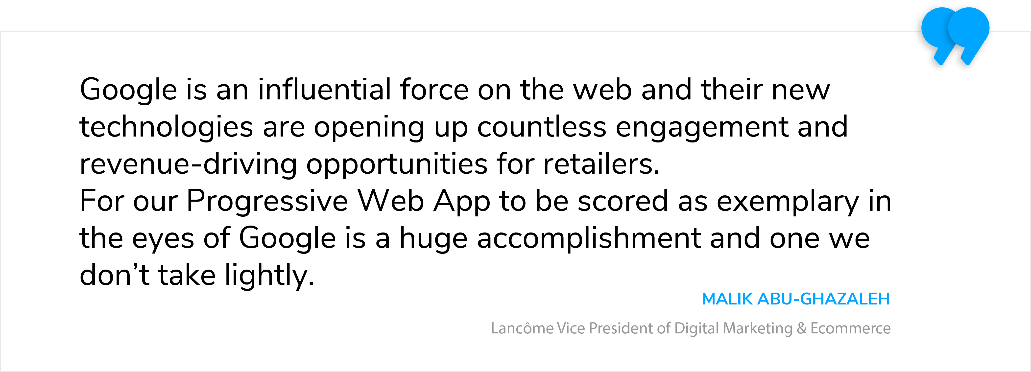
The new progressive website was categorized by Google as “exemplary”. Google’s auditing tool after testing the performance of PWA (on a scale from 1 to 100), gave the Lancôme’s progressive online application a Lighthouse score of 94/100.
With the new PWA Lancôme observed an increase in engagement rate, the session length boosted by 51%, bounce rate decreased by 10%.
Push notifications, compared to emails significantly improved customer relationships.
Around 18,000 users have signed up for alerts since launch!
They also improved income, as 8% of clients who opened push notification made a purchase.
One more benefit of Lancôme PWA is that the time until the page is interactive decreased by 84%.
Industry: Social network
Monthly traffic – 4.3B
Is there really any need to introduce Twitter?
You’ve probably used it today to share something of great value or to look at some cat pics. As it has billions of active users per month, Twitter is one of the most illustrative case studies among our PWA examples.
The Challenge: High Load Time and Mobile Space
The Twitter team discovered that users had a number of obstacles with their mobile website because of slow mobile networks and limited space on smartphones. Hence, they used Twitter from time to time and were not interested in posting and commenting much. 80% of Twitter’s traffic comes from mobile devices and the social media giant saw a great opportunity to improve its mobile experience.
The Solution: Increase Engagement and Reduce Data Usage
Progressive Web App seemed to be the best choice of a modern website with native features. Instant loading, lower data consumption, and large accessibility were features Twitter was looking for.
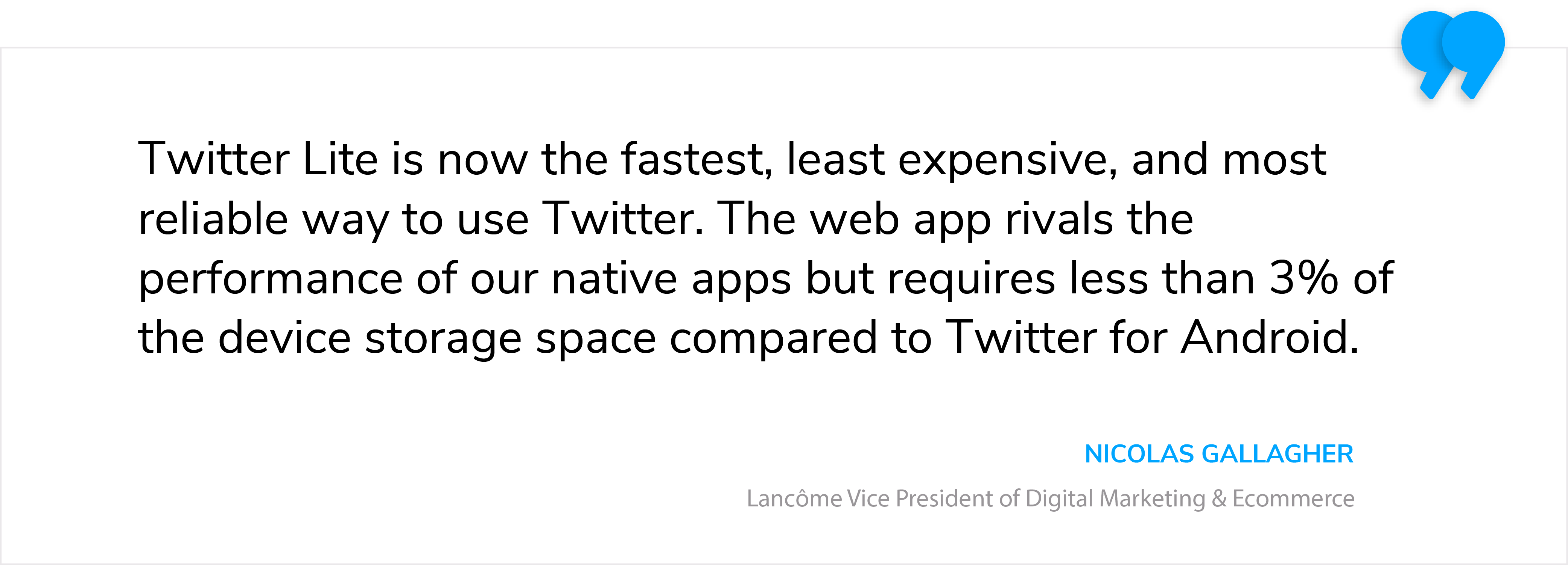
In 2017 Twitter rolled out its Progressive Web App called Twitter Lite. And the name is no joke – the PWA takes up only 600KB (less than 3% of its native apps storage requirement)! For first-time users, Twitter Lite loads in less than five seconds (using 3G). After that, you can expect it to load almost immediately.
The Results: Almost Instant Loading and Decreased Bounce Rate by 20%
Twitter is the fast food of the social media: the faster you get your snacks, the more you want. The benefit of decreased load times assisted Twitter Light users to:
- consume 65% more pages in a single session;
- send 75% more tweets;
- have 20% lower bounce rates; and
- have 30% reduction in loading time.
Thanks to the “Add to Homescreen” prompt and push notifications, Twitter Lite enjoys 250,000 unique daily users, each visiting the site 4 times a day on average.
Settled
Industry: Real Estate
Monthly traffic – 22.3K
Visit: settled.co.uk
Settled is a real estate company which provides its users with an opportunity to buy and sell property online.
The Challenge: Polish Up Mobile User Experience
The company found out that most of the users (over 50%) access the site from their smartphones. Settled wanted to offer a fast, reliable, and engaging mobile experience with offline functionality.
The Solution: Build PWA for More Engagement
As a result, the company implemented a Progressive Web App for its dashboard called Hub. Users who open the dashboard can find a fast app-like user experience, including listing status, chat, sign up for mortgages and much more.
The Results: 13% decrease in bounce rates
Settled’s Progressive Web App successfully increased conversions and mobile transactions by providing users with an easy-to-use, fast, and hassle-free mobile web experience. Here are some of the key results:
- +8% in mobile transactions;
- +23% in mobile conversions;
- – 14% in overall cost per conversion;
- – 13% in mobile bounce rate.
Trivago
Industry: Travel
Monthly traffic – 1.7M
Visit: Trivago.com
Trivago, one of the most widely known hotel search engines, stepped up to change the mobile booking experience of users with its Progressive Web App.
The Challenge: High Mobile Traffic Along With Unreliable Networks
The company analyzed their traffic and found out that users mostly use mobile devices to access the service. Even with the mobile app, users suffered from unreliable internet connections, broken sessions or failed searches when traveling underground. More importantly, users were unlikely to download a native app just to understand whether it provided necessary services.
The Solution: Focus on the Most Important Features
Trivago team looked for a solution able to work in offline mode, send push notifications and be accessible through a mobile browser (the most important factor!). This is how Trivago PWA saw the light.
By focusing on high-priority features like push notifications, offline access and add to home screen button, the small team of developers proceeded with building a PWA. The biggest challenge, according to designer Laura Oades, was creating an intuitive UI, as mobile appearance differs from that on typical websites.
The Results: 150% increase in engagement
Today Trivago PWA delights users in 55 countries and 33 languages.
Engagement for those who add to the home screen (and it is around 500 000 users!) skyrocketed to 150%. Push notification, completely changing the way the company previously reached out to users, improved conversion, with a 97% increase in click outs to hotel offers. Progressive Web App continues attracting more and more users: repeat visits increased to an average of 2 (compared to 0,8 previously).
Alibaba
Industry: B2B marketplace
Monthly traffic – 155.6M
Visit: m.alibaba.com
Alibaba is the world champion when it comes to the heavyweight Business-to-Business marketplaces. The company unites sellers and buyers from a great number of countries and stands out among other web application examples in this industry.
The Challenge: Website is Inconvenient for Mobile Users
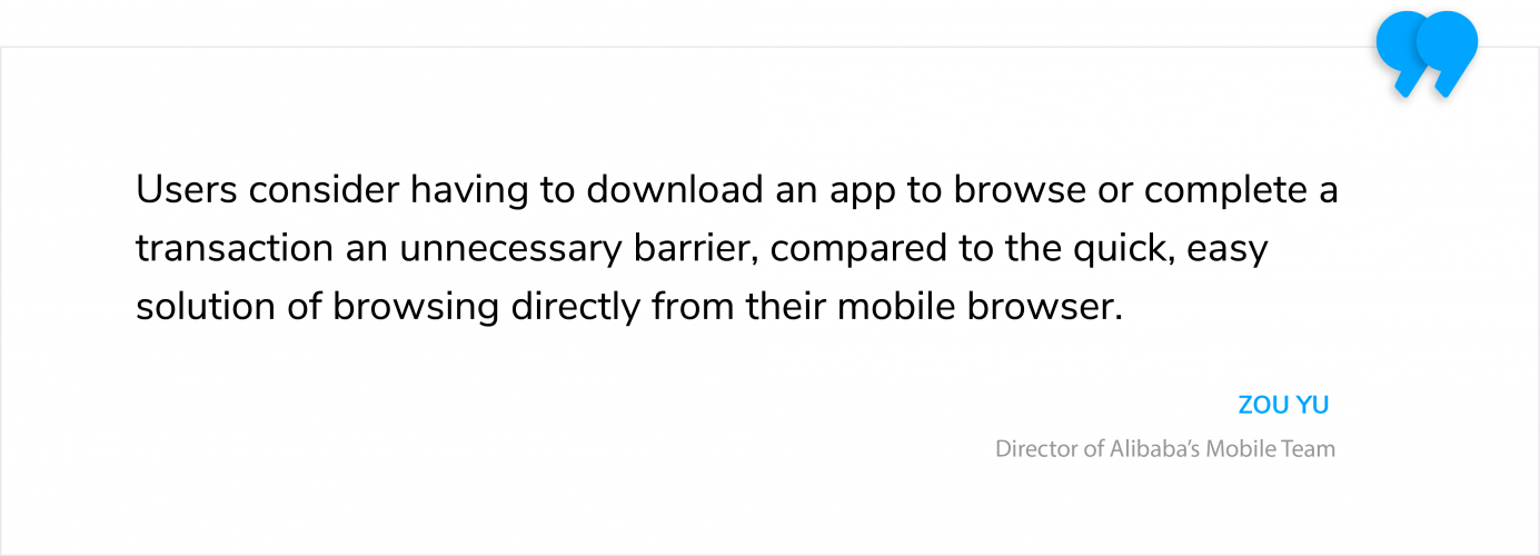
The store relied on its website to reach its mobile users. But the users themselves found the experience somewhat lacking. At the same time, Alibaba’s effort to drive traffic to their native apps has run into some difficulties as users were reluctant to take the extra step and download the app.
The Solution: Bridge Users of Native App and Mobile Web
Alibaba tried to create an effective mobile presence for the native app and mobile web users. The company went to pains to deliver a brilliant experience for both first-time visitors (trying to re-engage them) and repeat customers (with a higher loyalty to the web). Here comes Alibaba’s progressive web app.
The Results: Increase in Conversion by 74%
The much smoother experience for first-timers and push notifications + home screen shortcut to re-engage seasoned users have provided Alibaba some neat benefits:
- +30% active visitors on Android/+14% on iOS;
- +300% re-engagement rate (on par with their native apps);
- +76% conversions; and
- +4X interaction rate from Add to Home screen.
Forbes
Industry: Online media
Monthly traffic – 123.6M
Visit: Forbes.com
This global media company also decided to investigate values of Progressive Web Apps and rolled out Forbes PWA, which is eminent among the rest best progressive news apps.
The Challenge: Slow Page Load Time and Poor Mobile Experience
As for any other online magazine and newspaper, mobile presence is mission-critical (especially with 50% of mobile traffic). The loading time of the previous Forbes mobile website was 6-12 seconds and home page weight exceeded 4 MB. It also had a bunch of file requests and other poor user experience parameters.
The Solution: More Engagement through Speed and Reliability
In order to improve the mobile experience and boost the engagement rate, Forbes developed a PWA which includes push notifications, offline support and add to home screen option. After Forbes is added to the home screen, a user is able to store attractive topics, stay informed when news from the selected field appears without being overwhelmed by all the data.
The Results: Increase in User Engagement by 100%
Thanks to the new technology used the Forbes PWA improved page loading time to 0.8 seconds. The company implemented the story format called Cards (based on the layout of Snapchat Stories) which can be swiped through any kind of content and Fluid, a new format for in-house ads aimed at faster loading on smartphones. Here are more results of the change:
- user sessions increased up to 43%;
- ad views up 20%;
- 3x increase in scroll depth;
- highly visual content; and
- 100% engagement.
What These PWA Examples Mean
Sure, there are a great number of other Progressive Web App examples not included in our list.
All of these webapp examples demonstrate that progressive web apps may become a great option to enhance the web presence of your business, offer app-like user experience with faster loading, no downloads, and lower data usage.
If you want to use the benefits of Progressive Web App technology for your business, MindK team is here to help, just drop us a line.

