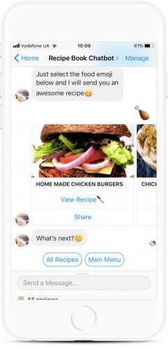
While the superintelligent AI remains a thing of the future, chatbots and voice assistants can cheer you up and remind you to exercise. Today is the day you’ll learn how to actually design engaging conversational interfaces.
Together with the tremendous reach of messengers like Facebook and Telegram, conversational UI (CUI) allow businesses to talk to billions of customers in their natural habitat. For instance, MindK reaches out to web-development newbies via WannaBe.Guru chatbot.
Based on our experience, I’ve written an article on the 8 most important questions you should ask yourself before building a bot for messengers. If you have already answered these questions, let’s get to work!
Step 1: Design your chatbot’s appearance
Bot’s visual appearance is something designers should care about.
You can’t set a stock photo of a smiling man as your bot’s avatar. People will communicate with a chat bot, not a real human and it should be reflected by the avatar.
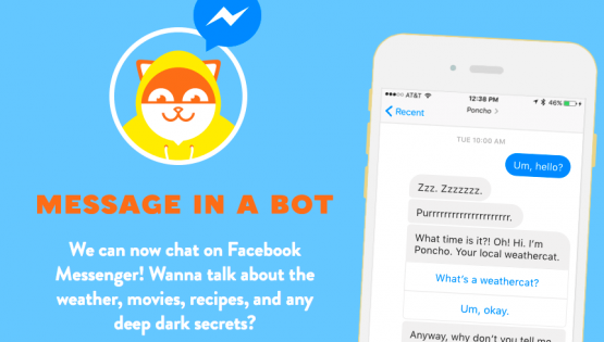
Think of your bot as a fictional character who has his personal info. Create a persona your customers would love to talk with. And draw his/her face. Faces work best for conversational UI.
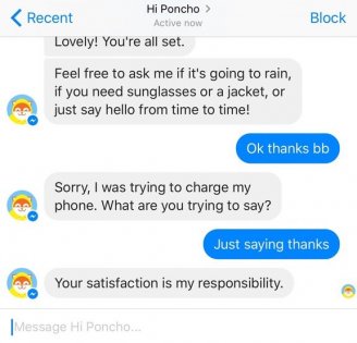
Cats work as well.
Without clear directions, people might think your bot can do anything they want. Or they could freeze in front of their screens not knowing what to do next.
Either way, the result is disappointment.
So greet your users first and then briefly explain what your bot is about.
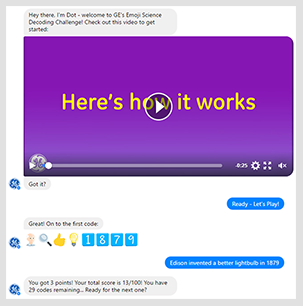
Illustrate your bot’s value with a gif-animation or a short video and win users’ attention.
GE’s Emoji Science Bot
But in most cases words are enough.
Now you need a call to action inviting your users to try it out. Start with something simple, a feature people can try out right away and feel rewarded.
This way, your bot will immediately prove its value.
But how will your users discover all the other features? On a website, you can see all its elements before your eyes.
But chatbots are a different story.
You’ll have to introduce new features at every opportunity.
After the bot has received its first input, list the things your users can do at this point and provide them with links to FAQs/documentation. On the successive visits, you can gradually remove the extra information and stop holding their hands.
Skyscanner Facebook bot
Step 2: Create user journeys
Now it’s time to create simplified conversation schematics to decide what should be designed next.
Start with the customer goals. Doing the user research and crafting the detailed personas will provide you with all the necessary info.
- Start with the so-called “happy path”.
This means an optimal scenario where users satisfy their needs in the most efficient way possible. There are no stupid questions, no misunderstandings or wandering thoughts. Ideally, your customers should be able to complete any action in under three steps.
- Craft the side paths.
Think of all the issues that might sidetrack users while they travel the happy path.
What obstacles may arise on their way? What questions might they ask? What information might they need to complete an action? What related needs may arise during the conversation?
When you factor in these issues, your conversation flow will branch into multiple side paths.
- Proceed to the edge cases.
At some point, your users will run into various errors and “I don’t know” responses. Those are the edge cases. They are extremely frustrating but sadly, unavoidable. Try to anticipate such points and prepare non-intrusive answers that’ll gently guide users back to the topic.
Step 3: UX power up
- Limit user freedom.
When you account for all possible outcomes, your dialogue becomes a tree with hundreds of branches. If you don’t apply constraints and bring the wandering users back to the happy path, you’ll end up with more variations than there are stars in the sky.
Cutting the extra branches would not only make your bot easier to develop but also improve the UX.
Frame your questions in a way that gives your users a hint of what you want to hear from them. Don’t ask rhetoric or open-ended questions.
“What color would you like for your sneakers?” would only confuse your users.
“Would you like black or white sneakers?” gives them two clearly defined options.
Bots don’t have to be purely about chat so it’s a good idea to provide various buttons, quick replies, menus along with the questions.
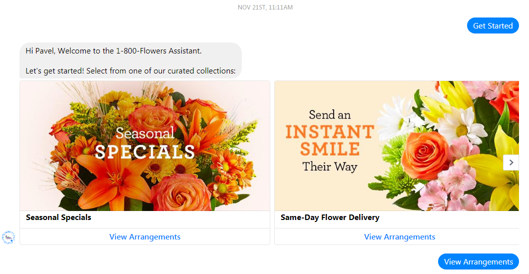
Buttons do not disappear when you click them and can provide functionality at any point in a conversation. You can scroll to the beginning of conversation and click that “View Arrangements” button to start over.
Quick replies, on the other hand, disappear after a single click making them context-dependent. They represent what users might think at the moment and should therefore, be written from their perspective.
Just keep in mind that people will quickly get used to buttons and forget they can actually type their messages. So remind them from time to time of the whole chat part of your bot.
And don’t forget about the slash commands! They provide a wonderful way for power users to speed up the interaction with your conversational UI.
- Validate the input.
Now you must ensure that the entered data is in fact correct.
Conversational interfaces give people the freedom to type whatever they want. Sometimes their answers already contain all the necessary data.
But there’s always a risk of partial or invalid data.
Here’s what you can do to prevent it with dialog.
Don’t mix up your questions. Don’t ask your users to name the color of their sneakers together with their size and brand. Ask three separate questions instead.
When you received a valid answer, let them know it, then proceed to the next question.
“Size 10, Roger that! And what color would you like?”
Or even better, you could ask for an explicit confirmation.
“Size 10. Is that correct?”
If the answer is invalid, point out what’s wrong with it; tell them what type of answer you’ve hoped for. Remember that there can be several reasons for why the answer is invalid.
- Input that doesn’t make sense:
“Did you just say ‘asdfg’? I don’t think that’s a size. Let’s try again, OK?”
- Input that is relevant but for some reason unacceptable:
“Unfortunately, we’re out of Size 10 sneakers. We have sizes 5, 5.5, 6, 7.5, 9, and 11. What size would you like?”
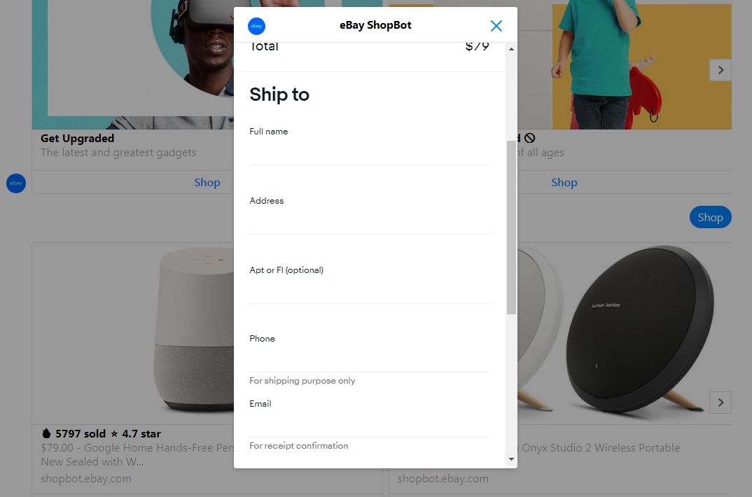
Advanced option: tasks that require multiple data inputs are better implemented via webviews. Facebook allows you to embed web pages within its Messenger making it possible to create such awesome experiences as Ebay’s shopping bot.
Webviews are also godsent for actions that take more than three steps to complete.
- Include nonverbal communication.
Non-verbal messages we receive in a human-to-human conversation is everything different from words. It can be gestures, facial expressions, tone of voice and also actions which have a common social meaning.
Emoji can add the much-needed expressiveness to your chatbot. So, don’t forget to use them in dialog for both user inputs and bot’s answers.
You can also include some non-lexical conversation sounds such as um, ah, uh-huh and mmm.
And remember to add a slight delay to the bot’s responses. This together with the ‘‘typing” indicator will make it seem like you’re actually talking to a real person.
Bonus point for adjusting the delay depending on the length of your message.
Just remember to warn the users if the bot’s response would take longer than 10-20 seconds.
- Set up the task switching.
GUI-based apps allow you to seamlessly switch between tasks. Not sure if you want those sneakers? You can decide that later. Just add them to cart and continue shopping.
But chatbots are a completely different matter. There are two ways your bot can react to the users who want to switch tasks:
- Ask for the explicit confirmation.
“You’ve almost completed a transaction. Are you sure you want to abort the current task?”
Doing this every time is extremely annoying. Resort to explicit confirmation only when switching tasks means losing a lot of progress.
- Obey the user and switch tasks.
This is the way to go when aborting the current task won’t have serious consequences. Just make sure to explain what you’re doing.
“Got it, switching categories from men’s sneakers to men’s boots.”
So now the user had switched from task X to task Y. But what to do when he or she has completed the task Y? Do you return to the previous task or start from the very beginning?
The first option is, of course, better, but you have to be extra careful not to confuse your users. So, again explain what you’re doing.
“Congratulations, you’ve completed the transaction! Do you want to return browsing sneakers?”
Add a go back button or other options to reset the conversation. One way to implement this is via the FB Messenger persistent menus. Just keep in mind that at the moment only one in twenty users knows about this feature.
- Know when to escalate to humans.
At some point, your CUI will run into a problem too difficult for its robotic brains. In such cases, it should hand over the conversation to humans. The trick here is to make contacting managers seamless and unintrusive.
Possible escalation triggers:
- Detecting user frustration via Natural Language Processing;
- Pressing the designated button or slash command;
- Displaying a prompt after several “don’t know” answers in a row.
Just make sure that users can opt out of escalation if they don’t want to contact humans.
Wrapping up
Today I’ve covered the major sticking points that can easily ruin the conversational experience.
Things like setting up incorrect expectations, waiting too long to reveal the bot’s true value or letting users derail the conversation will instantly put your bot into the “never touch again” category.
But that fate is not for you.
You know how your bot will look and feel like. You’re ready to create conversation flows that will keep your users engaged and enchanted.
But still there is a single element missing from the picture. The compelling dialog scripts.
So tune in for the third piece on conversational interfaces from MindK in which I’ll reveal the secret to writing brilliant chatbot dialogue.

