Healthcare startups face an uphill battle. How do they succeed in a highly regulated market and win the trust of doctors, nurses, and patients? Everything counts—features, security, marketing, and, of course, AI. Yet, many companies still overlook the hidden costs of healthcare UX design.
As a healthcare design (and development) agency, MindK is well aware of these pains. We’ve created this guide for those who want to avoid these nasty complications with an effective 7-step remedy process.
Table of contents:
- Hidden costs of poor UX design in healthcare
- Unique challenges of medical UX design
- 7 best remedies for medical UX challenges
- User-centered design
- Streamlined onboarding
- Intuitive navigation
- Effective data visualization
- Consistent and standardized interfaces
- Accessibility and inclusivity
- Usability testing
Hidden costs of poor UX design in healthcare
In 2024 alone, the US healthcare lost $8 billion USD due to software inefficiencies. Almost half of the industry professionals cite user experience as the top reason why these IT systems fail so much.
Yet, financial harm is by no means the biggest issue.
Researchers once analyzed 9,000 patient safety reports in three pediatric facilities. They discovered that 36% of reports mentioned at least one usability issue. 609 of those usability-related events may have resulted in real patient harm.
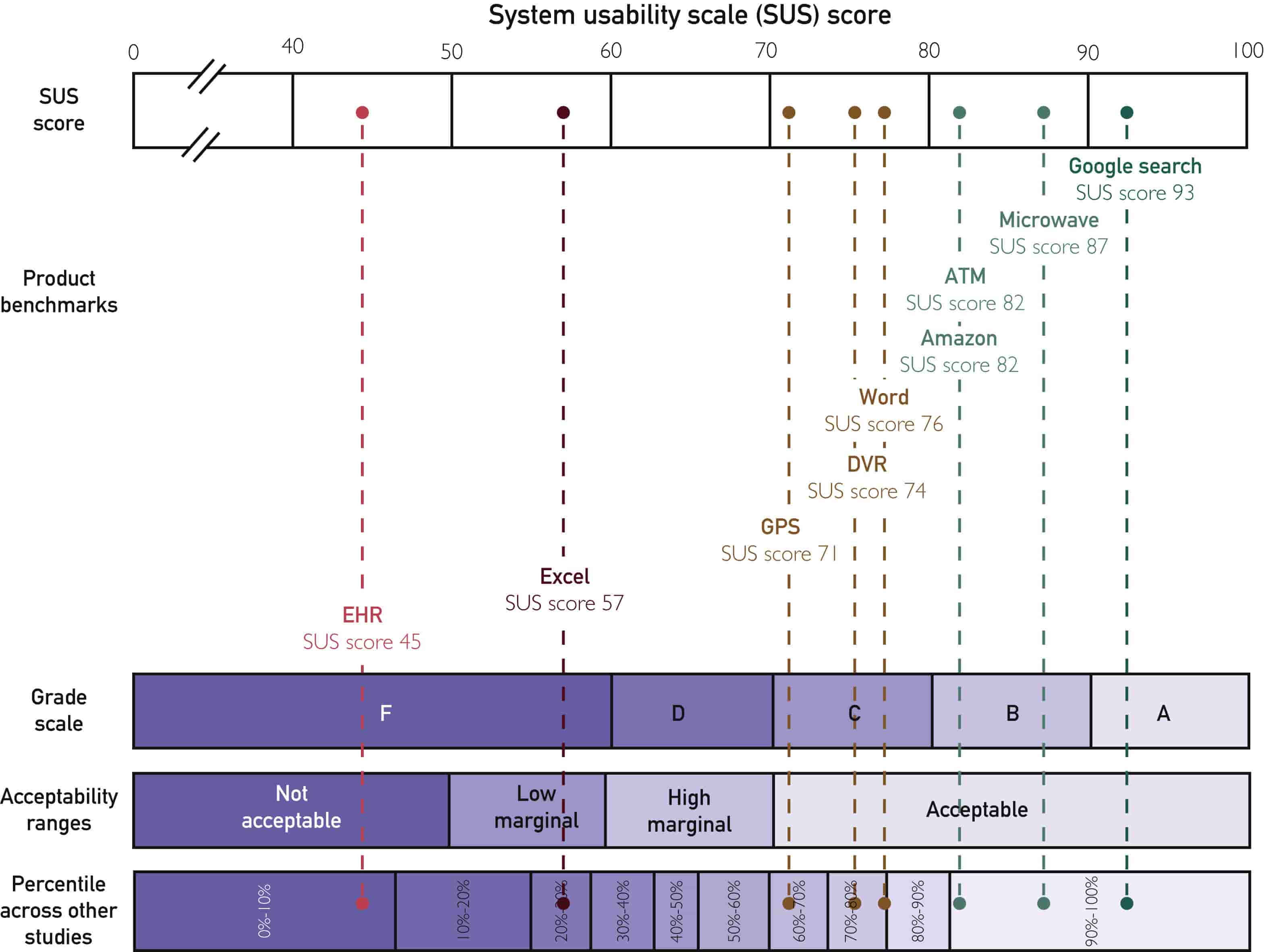
EHR usability, in particular, is mentioned in about one in 1,000 safety events, according to a much larger study. For every hour of face-to-face work with patients, doctors spend between 1 and 2 hours in digital systems. However, EHR systems rank in the bottom 9% of usability scores (SUS) when looking at software across all industries. Mayo Clinic has also found a strong link between bad usability and physician burnout.
Medical app interfaces can delay crucial decisions and multiply mistakes, such as wrong medication or dosage. They also have the power to speed up onboarding, reduce clinician errors, and accelerate adoption. This means hitting growth targets sooner, impressing investors with strong user metrics, and building a product that thrives in a competitive ecosystem.
Now, let’s understand how to create good healthcare UX design.
Unique challenges of medical UX design
To avoid these hidden costs, designers must consider challenges that go well beyond their typical concerns.
1. Securing patients’ trust and safety
Reducing clinical errors is the core challenge of healthcare UX design. Medical environments are fast-paced, information-dense, and prone to interruptions. Missing a critical alert or misunderstanding patient data may lead to incorrect dosages or overlooked allergies.
Moreover, clinicians are often stressed and overworked. Busy interfaces do nothing to alleviate their cognitive load, contributing to errors. Designers have to find a way to:
- Сommunicate critical information in a clear and intuitive way.
- Respect patient autonomy, privacy, and informed consent
- Support rapid context-switching for medical professionals.
- Avoid designs that unintentionally coerce or mislead patients and clinicians.
- Ensure algorithmic recommendations (AI/ML) clearly communicate risks, limitations, and transparency to clinicians.
2. Complex workflows and multiple roles
Each role (doctor, nurse, technician, admin staff, patient) has distinct tasks and priorities. Clinicians, for example, need rapid patient data access, while administrators prioritize documentation and compliance. This adds unnecessary complexity to unified UX.
For example, one of our recent projects involved medical charting for lactation consultants. They are taught to chart in a very specific way. It’s very different from radiologists or oncologists. So, adding this functionality to EMR required modifying over 400 interactive forms.
Tech literacy is another consideration. UX often has to cater to tech-savvy IT admins, less technical staff, clinicians, and people who barely interact with digital systems.
3. Offline/limited connectivity
Many patients live in rural areas or have emergencies in the middle of nowhere. That’s why, medical software has to function reliably with limited or no connectivity.
Most projects at MindK now include offline data entry and database synch for medical records. Your UI must clearly indicate connectivity status and transition smoothly between offline and online modes.
4. Interoperability requirements
Healthcare software often aggregates data from multiple sources including EHRs, diagnostic tools, and wearables. Combining this data into a cohesive and clear UX is a challenge. Inconsistencies in data formats (HL7, FHIR) and terminology only add more potential for error.
5. Data integrity, privacy, and compliance
Regulatory requirements, such as HIPAA, often dictate interface elements such as mandatory authentication steps or explicit data consent. Given severe compliance risks, the UX must support accurate, error-free input of sensitive data. Authentication, access controls, logging, and reporting mustn’t compromise clinical workflows or frustrate users.
6. Balancing customization with complexity
Customization is a key aspect of modern SaaS applications, including:
- Configurable workflows.
- Branding and white-labeling.
- Feature selection.
However, medical software users often value standardized, proven workflows that align with clinical best practices and regulatory requirements.
Over-customization may introduce complexity and errors, which was a huge challenge when migrating an occupational health app to multi-tenant SaaS with extensive customization for individual tenants.
7 best remedies for medical UX challenges
Now, let’s examine how medical website designers can delight users, reduce the number of clinical errors, prevent burnout, and win the trust of medical professionals.
#1 User-centered design
User-centered design (UCD) places the needs, preferences, and goals of end-users at the forefront of the process. Applying UCD requires deep immersion into clinical environments, understanding nuanced workflows, and continuous validation from healthcare professionals.
At MindK, medical UI/UX designers and Business Analysts use the following approaches to make it happen:
- User research involves gathering insights about the target audiences, their behaviors, motivations, and pain points. In addition to interviews, surveys, and user testing are staples at this point, we also recommend clinical observations, focus groups, and workflow shadowing in medical settings.
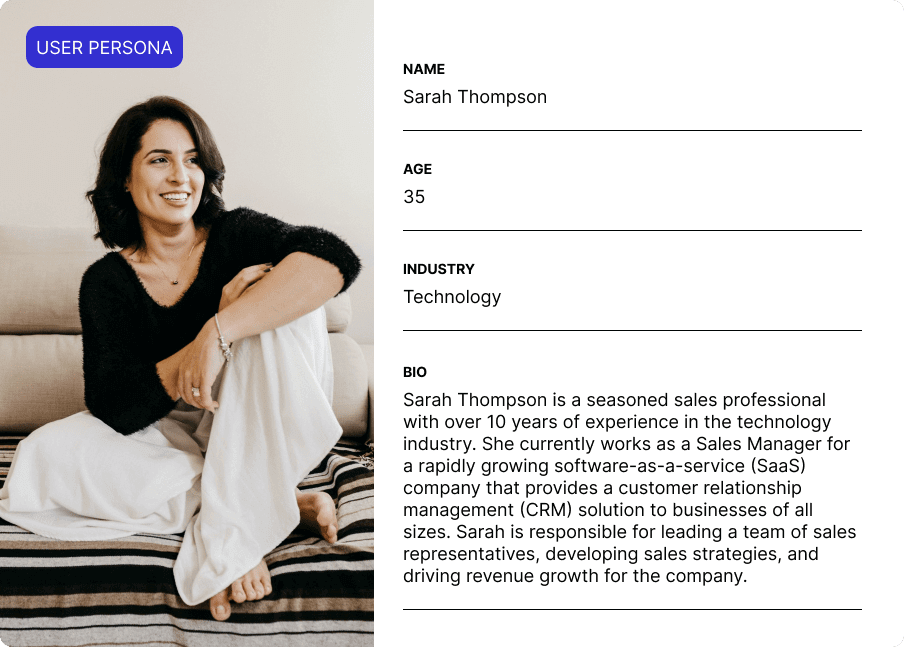
- User personas aim to capture the distinct needs, challenges, and goals of different roles (physicians, nurses, technicians, administrative staff, and patients). Personas help designers empathize with real people using your software in often unpleasant situations.
Example of user personas we did for one of our projects
- User journey mapping visualizes the steps users perform in a medical application. Identifying critical touchpoints like admissions, medication orders, patient monitoring, and discharge helps uncover UX pains and reduce the potential for errors.
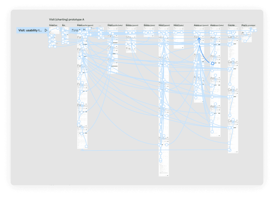
- Iterative prototyping with clinical validation. In healthcare, we create interactive mockups of high-risk workflows (e.g., medication management, patient data input, emergency alerts) and collect clinician feedback. This ensures alignment with medical regulations, safety standards, and clinical expectations.
- Usability testing involves observing clinicians as they interact with clickable prototypes or software in realistic scenarios. These interactions are evaluated against clinical priorities, such as speed, accuracy, cognitive load, and error prevention.
This is how prototyping may look like (based on the example of one of our projects)
#2 Streamlined onboarding
Medical care is painful enough without looking at bloated interfaces and functionality that doesn’t make sense. Onboarding is our best chance to smooth users into a new and unfamiliar system.
- Simplified, role-specific onboarding to guide users through the initial steps. You can use tooltips and contextual help for key features and buttons. Each role’s onboarding should address unique needs, such as patient care processes for clinicians vs. reporting and documentation for admin staff.
- Guided tours are similar but different. They can be triggered during the first login, or accessed through a dedicated “Getting Started” section. Guided tours demonstrate workflows relevant to real-life medical scenarios, such as patient data entry, medication management, or patient monitoring.
- Progressive onboarding minimizes cognitive overload by breaking onboarding into small, digestible steps. You may begin with fundamental, high-frequency clinical tasks. Then, progress to more specialized features, respecting clinicians’ limited availability and high workload.
- Pre-filled data in forms and fields saves a user’s time and effort during the onboarding process.
- Onboarding videos are another great way to illustrate specific clinical workflows within the software. Embed these tutorials directly into onboarding materials or offer quick access from a dedicated resource section.
- Interactive checklists for compliance. Use visual checklists and progress trackers clearly outlining required training, certifications, or regulatory tasks (e.g., HIPAA training, clinical documentation compliance).
- Personalized onboarding is another good practice. It allows users to tailor the learning process to their specialty, expertise, and time constraints.
Contextual help is crucial for users with high cognitive load. These timely, role-specific tips can triggered when engaging with new or complex features (e.g., prescribing medications, recording patient notes, or generating reports).
Task-specific suggestions are tailored to the user’s context within the app. Whether it’s a reminder about a helpful shortcut or a timely warning, these tips are designed to enhance the user’s workflow. Pop-ups or in-app notifications should be concise and non-intrusive to help users stay focused. Visual cues like arrows, circles, or color changes can draw attention to specific elements or actions.
On-demand clinical support resources, knowledge bases, support chats, and FAQs provide value beyond onboarding. Clearly identify and categorize these resources so that users find the information they need without wasting much time.
#3 Intuitive navigation
Here we recommend several approaches for a user-friendly experience:
- Clinically-driven information hierarchy. Organize medical app interfaces around user priorities, emphasizing urgent patient information, critical alerts, and essential medical tasks.
- Simplified menu structures. Categorize menu items into logical groups with familiar and descriptive labels. You may tailor menu structures to healthcare roles (physicians, nurses, admin), highlighting only the most relevant functions for each user group. Keep the structure simple and concise with expandable menus to minimize clutter.
- Progressive disclosure. Present critical functionalities right away. Reveal advanced or specialized options as needed.
- Breadcrumb navigation provides a trail of links that shows the user’s current location. It allows efficient backtracking, which is crucial during time-sensitive medical tasks.
- Visual workflow overview. Provide diagrams and dashboards of clinical workflows or patient-care pathways to enhance clarity. Clearly illustrate the relationships between different modules/features to help clinicians maintain context.
- Contextual shortcuts and quick access to frequently used or urgent functions (e.g., medication lookup, lab results, patient alerts).
- Consistency in terminology, navigation patterns, and interaction models across various modules (patient management, prescribing medication, administrative functions).
- System structure page can be necessary for complex apps to help users navigate to different modules or sections.
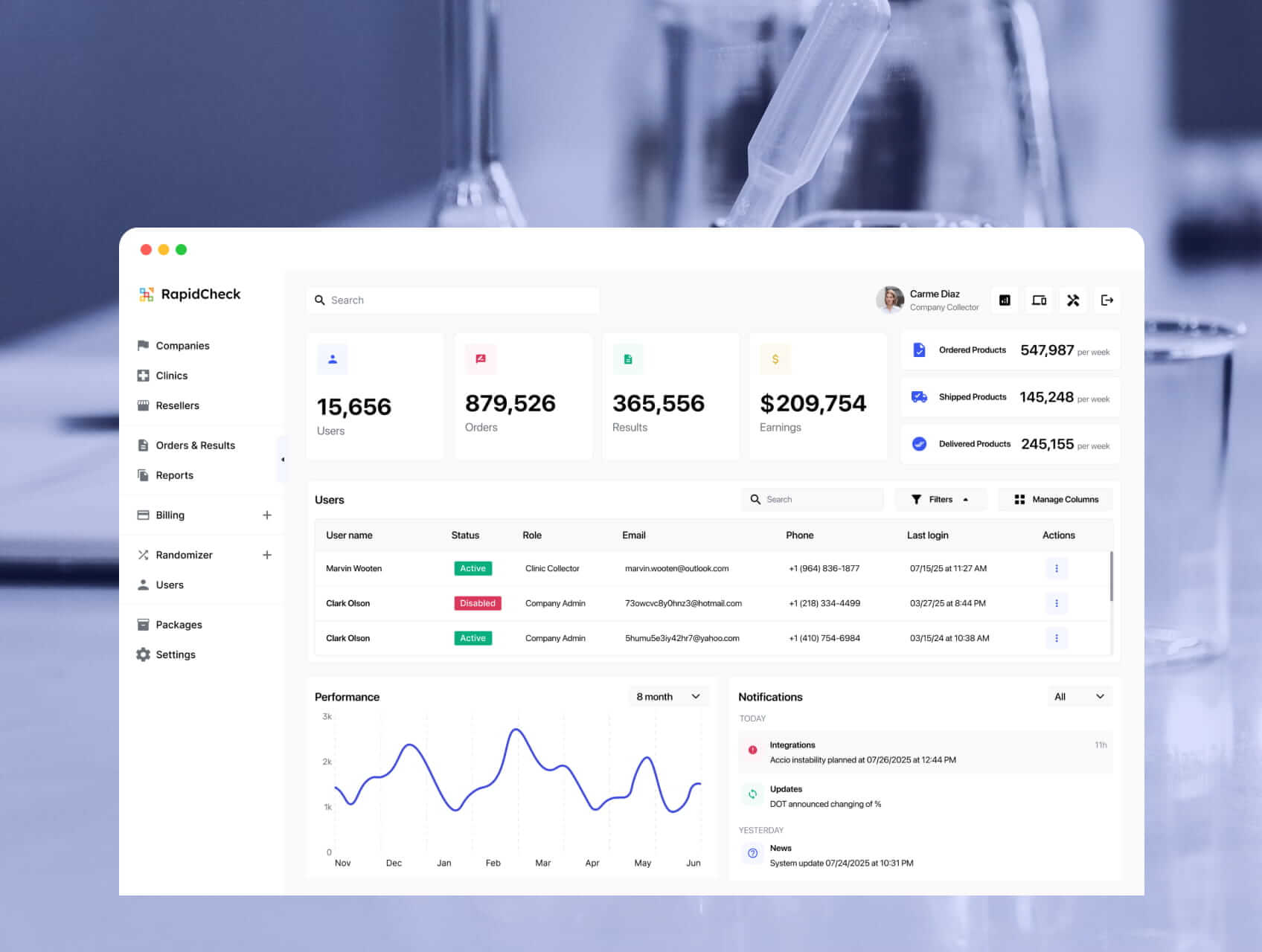
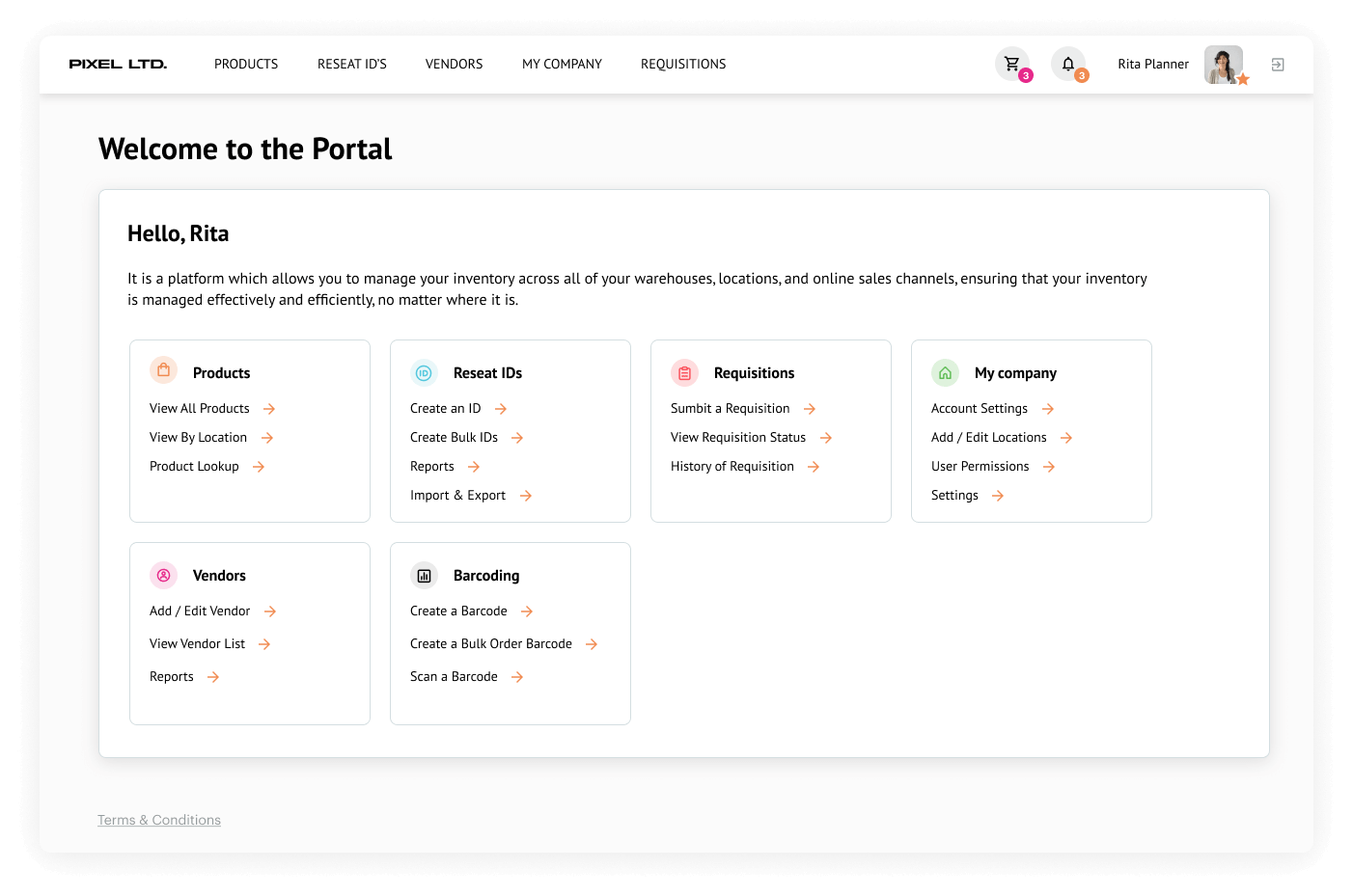
Example of clear information hierarchy and navigation on one of our projects
#4 Effective data visualization
Here are the most common approaches to translating complex medical data into actionable insights.
- Clinical dashboards provide a consolidated view of multiple data visualizations, often in the form of widgets or tiles. They allow users to monitor key metrics like patient vitals, medical alerts, and treatment progress. Dashboards are usually customizable. Users can select visualizations and metrics that are most relevant to their needs.
- Trend and time-series charts represent numerical or categorical data. This includes patient health trends (vital signs, medication response, disease progression), line charts, area charts, and stacked graphs that highlight changes over time.
- Diagnostic and lab result visualizations to support rapid interpretation and clinical decisions. Visuals like bar charts, scatter plots, and reference-range comparisons quickly illustrate deviations from expected norms.
- Hierarchical and organizational diagrams illustrate treatment pathways, patient care workflows, or decision trees. They guide clinicians through standardized procedures or emergency protocols.
- Heatmaps and risk indicators visualize patient populations and distribution, identifying high-risk areas or emerging health patterns.
#5 Consistent and standardized UI
Consistent design directly reduces clinical errors, supports rapid decision-making, and improves user satisfaction. At MindK, we recommend using healthcare-specific design systems for standardization and consistency.
A design system is a collection of reusable components, guidelines, and assets. It’s a single source of truth for designers, developers, and other team members, consisting of:
| Design guidelines | Visual and interaction principles that cover color palette, typography, iconography, spacing, grid systems, and responsive design. |
| Design components | Buttons, navigation menus, standardized medical forms, patient dashboards, data entry fields, alerts, etc. Components should be consistent in appearance and behavior to ensure a cohesive UX. |
| Design patterns | Readymade solutions for recurring UX challenges like patient identification, medication dosage entries, and error prevention. |
| UI assets | Icons, illustrations, and imagery that align with your visual style, healthcare regulations, and conventions. |
| Documentation | Detailed documentation is useful both for the internal team and regulatory compliance. |
A robust design system is key to maintaining consistency, compliance, and clinical accuracy. At MindK, we’ve honed a process to create an effective design system for healthcare applications:
- Establish clear design principles. We kick things off by defining the principles that will serve as guiding lights, ensuring a consistent and cohesive design language.
- Identify core components. Pinpoint the essential design components, such as buttons, form fields, typography, icons, and navigation elements. Then, create a comprehensive library with guidelines for their usage and behavior.
- Craft visual guidelines for every aspect, from colors to typography, spacing to imagery. By clearly defining how these elements should be used, you can maintain a harmonious and recognizable visual identity.
- Document interaction patterns from onboarding flows to charting and e-prescription. Provide clear guidelines on how to design and implement these interactions consistently.
- Collaborate and gather feedback. We actively seek out feedback from key stakeholders and healthcare professionals to validate and refine the design system.
- Iterate and refine. A design system is an ever-evolving entity. It needs to be adapted to feedback and industry changes. Revisit and refine components, guidelines, and patterns to keep the design system fresh and effective.
- Thorough documentation is the team’s go-to resource. Include clear guidelines, usage examples, code snippets, and detailed explanations for each component and interaction pattern.
- Promote adoption and education. Run workshops, training sessions, and demos to ensure team members know how to utilize the design system effectively.
#6 Accessibility and inclusivity
Accessibility isn’t just a best practice, it’s an absolute must-have in healthcare software. Here are the key approaches to ensuring your application is usable and enjoyable for everyone:
- Keyboard accessibility. Ensure that all interactive elements, such as buttons, links, and form fields, can be used without relying on a mouse. This is a critical requirement for people with disabilities and situations where mouse usage isn’t practical or possible.
- Color contrast. Use appropriate color combinations to ensure sufficient contrast between text and background elements. This makes content readable for users with visual impairments and reduces eye strain for everyone.
- Text readability. Use legible fonts with appropriate sizes and line spacing. Avoid using small or decorative fonts that may be difficult for users with visual impairments.
- Testing with assistive technologies. User testing with screen readers, keyboard-only navigation, and voice recognition ensures that software remains usable and safe in realistic healthcare scenarios.
- Help and documentation. Provide clearly structured, accessible documentation designed explicitly for users with disabilities, including clinicians and patients, to help them effectively understand and utilize software features.
Lastly, it’s important to stay updated with accessibility guidelines, such as the Web Content Accessibility Guidelines (WCAG), and the working WCAG 3 drafts.
#7 Usability testing
Healthcare design often involves actively seeking feedback from patients and clinical professionals. Here are a couple of ways you can continuously improve design through feedback:
- Provide multiple feedback channels
Establish accessible and convenient feedback methods specifically for busy clinical users: feedback forms, brief targeted surveys, direct clinical support channels, and so on.
- Listen and respond
Analyze feedback regularly, paying attention to clinical safety issues, workflow inefficiencies, and user frustrations. Responding proactively responses show that you’re listening and taking user input seriously.
Identify common themes across the feedback. Prioritize issues that significantly impact clinical safety, clinician satisfaction, or patient outcomes.
- Conduct real-world usability testing
Capture detailed insights into how users interact with the system in realistic conditions to pinpoint areas needing improvement.
- Prioritize based on clinical impact
Focus on issues that directly affect patient safety, clinical accuracy, or regulatory compliance. The most critical or frequent feedback is what we try to fix as soon as possible.
- Improve iteratively
Implementing small changes allows us to systematically measure their impact. Metrics like adoption rates, user satisfaction scores, error rates, and similar metrics can confirm the effectiveness of changes with real-world clinical outcomes.
- Stay transparent
Communicate clearly to clinical users how their feedback has influenced UX changes. This fosters trust, engagement, and a sense of ownership.
Conclusion
Bad design results in eye-watering losses for healthcare businesses, physician burnout, and real human tragedies. To avoid these risks, designers must consider the unique challenges of medical software. Complex workflows, regulatory requirements, multiple roles and stakeholders with conflicting interests can cause a major headache for designers.
The best practices outlined in the article can remedy these complications. Prophylactic use of design systems, user-centered design, and testing in clinical settings help us design more effective and safer medical software.
Have some questions? Looking for healthcare UI/UX design services? Don’t hesitate to drop us a line to arrange a free design workshop for your software concept or a UX audit of an existing system.
